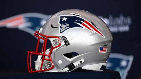
The New England Patriots have benefited from having two of the best logos in NFL history. The “Flying Elvis” is refreshingly clean, and the vintage “Pat the Patriot” is as all-round awesome, though complicated to a fault.
However, there was a time when the Patriots nearly rolled out what would’ve been one of the ugliest logos in sports.
Patriots.com’s Angelique Fiske on Friday published a story about the history of the Patriots logo. The most fascinating big pertained to a 1979 contest in which fans were called to vote on a potential new face of the franchise.
Take a look:

Patriots
The solider is kind of cool, but that logo? It looks like someone with a passion for Mt. Rushmore or The Old Man on the Mountain got their hands on Microsoft Paint a decade before its 1985 release. Say what you will about the “Flying Elvis,” but it’s much better than USAA Patriot.
It’s no wonder why, according to Fiske, old Schaefer Stadium filled with boos when the logo was presented.
Here’s Fiske’s story, which contains plenty of interesting facts about the Patriots, including the history of the name and the logo:
What if we told you there was a time this almost became the #Patriots logo?!
From @TheHall: How the flying Elvis came to be: https://t.co/gHKmQrSpGk
— New England Patriots (@Patriots) February 23, 2020