Major League Baseball took a huge leap throughout the past few years in allowing teams and players to unleash their creative sides on the diamond by introducing new uniforms and uplifting previously enforced regulations.
In 2018, MLB abolished its 51 percent rule, which required players to wear cleats that featured at least 51% of their respective team colors. Essentially, that limited players to wearing cleats that were generally simple, and at times, very bland.
Now, MLB took the initiative to reach out to a younger demographic and upgrade its wardrobe to a more modern style. Just like with the Little League Classic or the City Connect uniforms, MLB’s newest installment of vibrance and creativity introduces a new collection of hats for spring training, which is set to begin in less than three weeks.
Here are the five best (non-Boston Red Sox) hats being dropped this year:
Story continues below advertisement
5.) Milwaukee Brewers
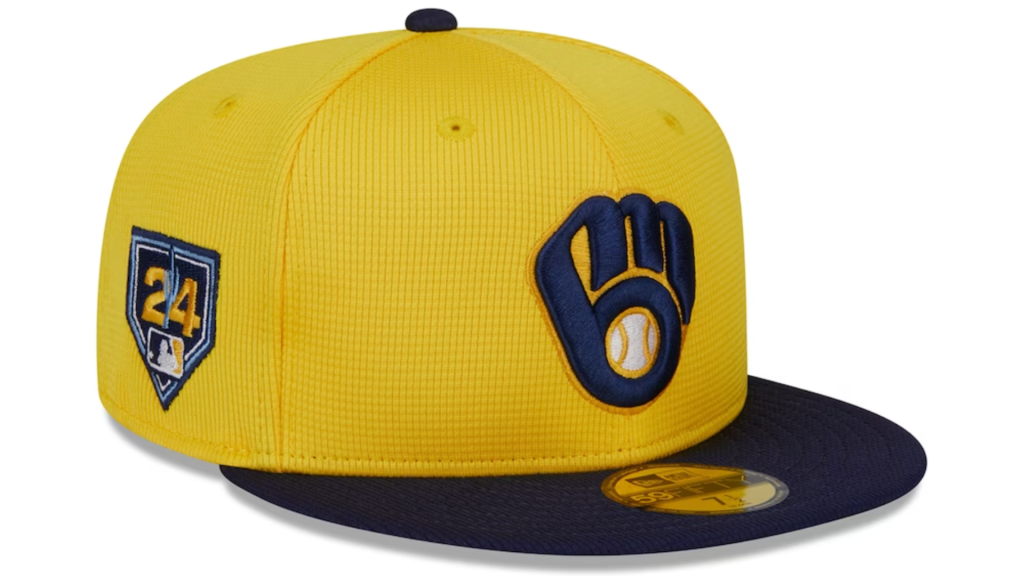
Milwaukee elected to go the classic route, which never fails.
Using the iconic ball-in-glove logo was a no-brainer. The Brewers don’t have a logo that even holds a candle to the simple, but always clean, mitten logo. Introduced in 1978, though with exclusively bright shades of yellow and blue, Milwaukee leaned toward tradition while replacing the bright blue with a never-could-go-wrong shade of navy.
4.) Miami Marlins
Story continues below advertisement
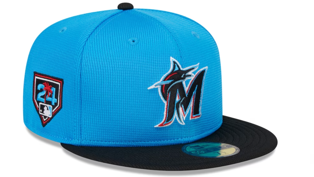
It’s hard to imagine Miami would make a top-five list for anything regarding its uniform that wasn’t a desperate reach back into time.
However, this time, the Marlins managed to come up with something that isn’t atrocious and doesn’t rip the Miami Heat’s over usage of the South Beach colorway (Pink, Teal).
Going with a darker shade of teal and crimson ended up being the right move. Both colors pop out with the black “M” and brim, giving Miami a hat that looks more in line with the rest of MLB. The “24” spring training emblem also stands out, most notably because of the crimson palm tree, bringing the hat all together. Considering the Marlins have desperately leaned toward this color pallet so many times, it’s difficult to put it any higher on the list than fourth.
MORE MLB
3.) Arizona Diamondbacks
Story continues below advertisement
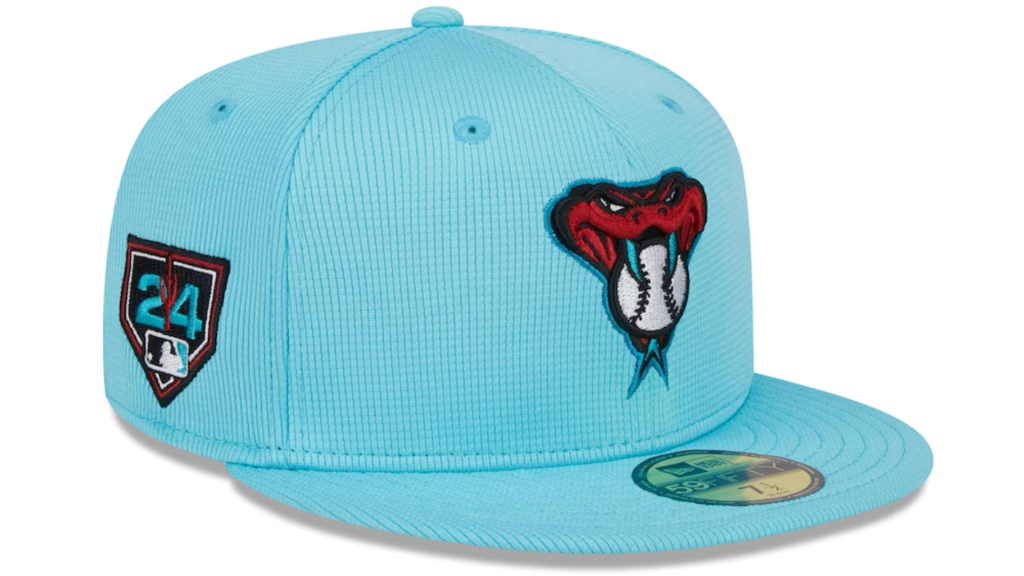
Similar to the Marlins, the Diamondbacks have had a difficult time finding a uniform that works. Also like Miami, Arizona has a perfectly fine pinstriped uniform, ironically worn by Hall of Famer Randy Johnson in a purple and teal colorway that could be worn for 162 days straight and nobody would have a problem with it.
Yet, in an attempt to flex a creativity bone that isn’t there, the Diamondbacks have flopped on countless occasions with ridiculously dark grey uniforms and batting practice-like jerseys in 2016. The Diamondbacks regained some brownie points last season by retreating back to the bright teal hits in a more subtle manner, and this spring, the brownie points keep on piling up.
Arizona’s hat, while perhaps would be better with a maroon brim too, is still among the cleanest in the bunch. The snake head logo with a baseball in between the teeth is solid and the colorway doesn’t do too much, which is hard when using a brighter shade of teal.
2.) Chicago Cubs
Story continues below advertisement
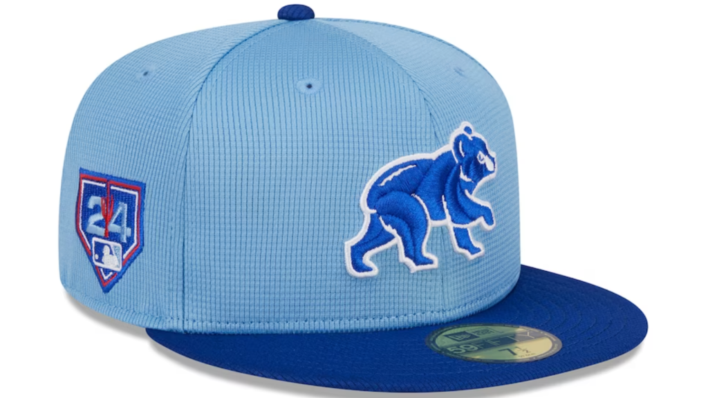
It’s hard to imagine Chicago taking the field without its iconic red “C” hat.
Yet, the Cubs managed to use predominantly two shades of blue while also capturing the two premier characteristics of the organization’s all-time best headwear: simple and clean.
The royal blue sideways bear outlined in white stitching can’t be beaten. Again, considering there’s no red, which in any other case should be a cardinal sin that disqualifies Chicago from this list entirely, only amplifies the Cubs even more since they still nailed it with this design — somehow.
1.) Seattle Mariners
Story continues below advertisement
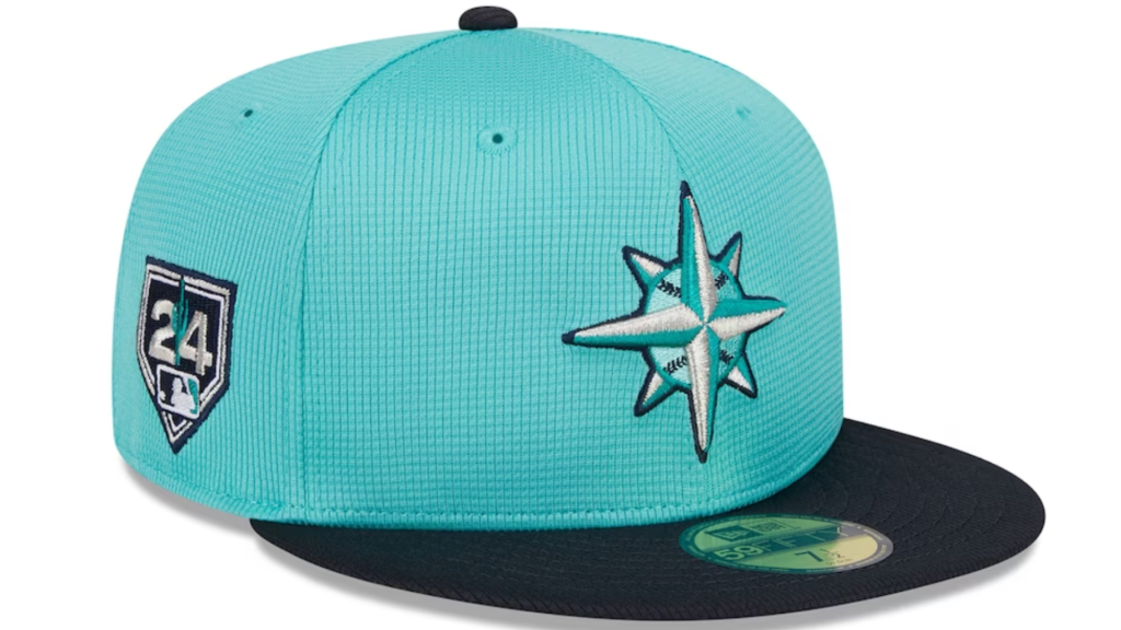
Seattle already has the credentials heading into this top-five list.
The Mariners have one of the all-time most classic uniforms, made iconic by Hall of Famer Ken “The Kid” Griffey Jr. — the definition of MLB swagger. Seattle’s teal with navy blue never goes wrong, plus that star-shaped logo overlaying a baseball is so traditional, but never gets old.
To be fair, the Mariners didn’t have to do much to (at least) finish among the top three, and that’s exactly what happened. Seattle for the win.
Featured image via Rob Schumacher/The Republic / USA TODAY NETWORK Images
